
Wine-Red Velvet Pillow Covers
One deliberate deep-color anchor on pale seating.
CheckConfirm cover size, insert fit and care.
See pillow option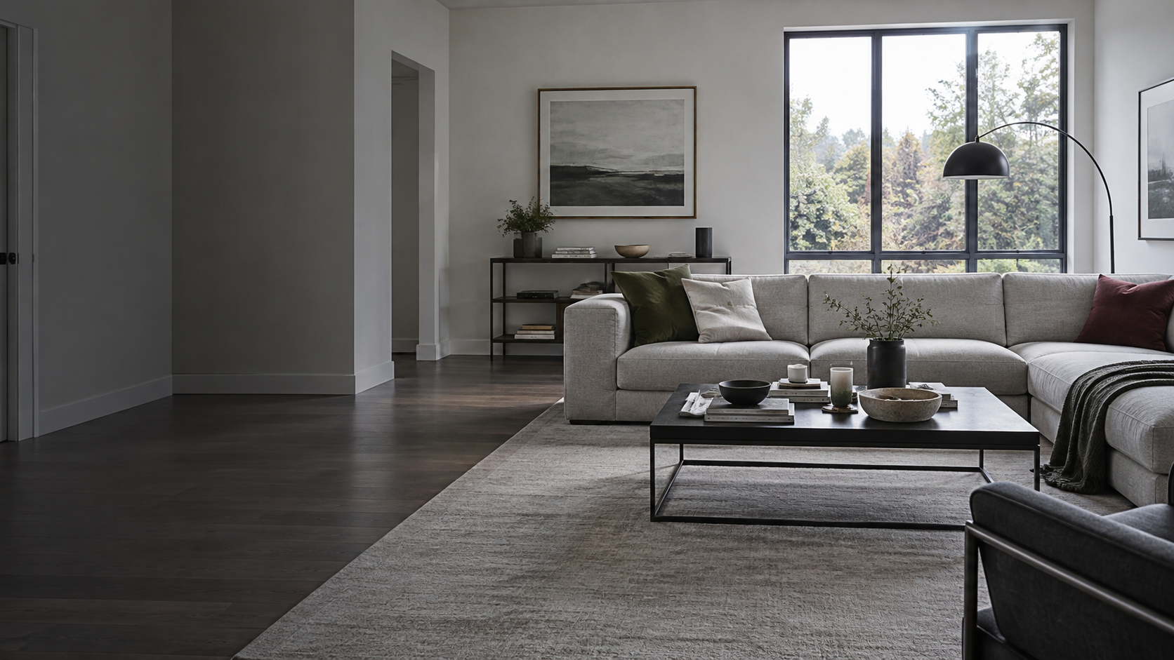
Start with the part that feels wrong. Add one accessory job at a time—height, softness, shape, function or contrast—then stop when the room reads as resolved.
Choose the zone that feels unresolved. The answer changes by location: the sofa needs a different kind of finish than the table, shelf or floor corner.
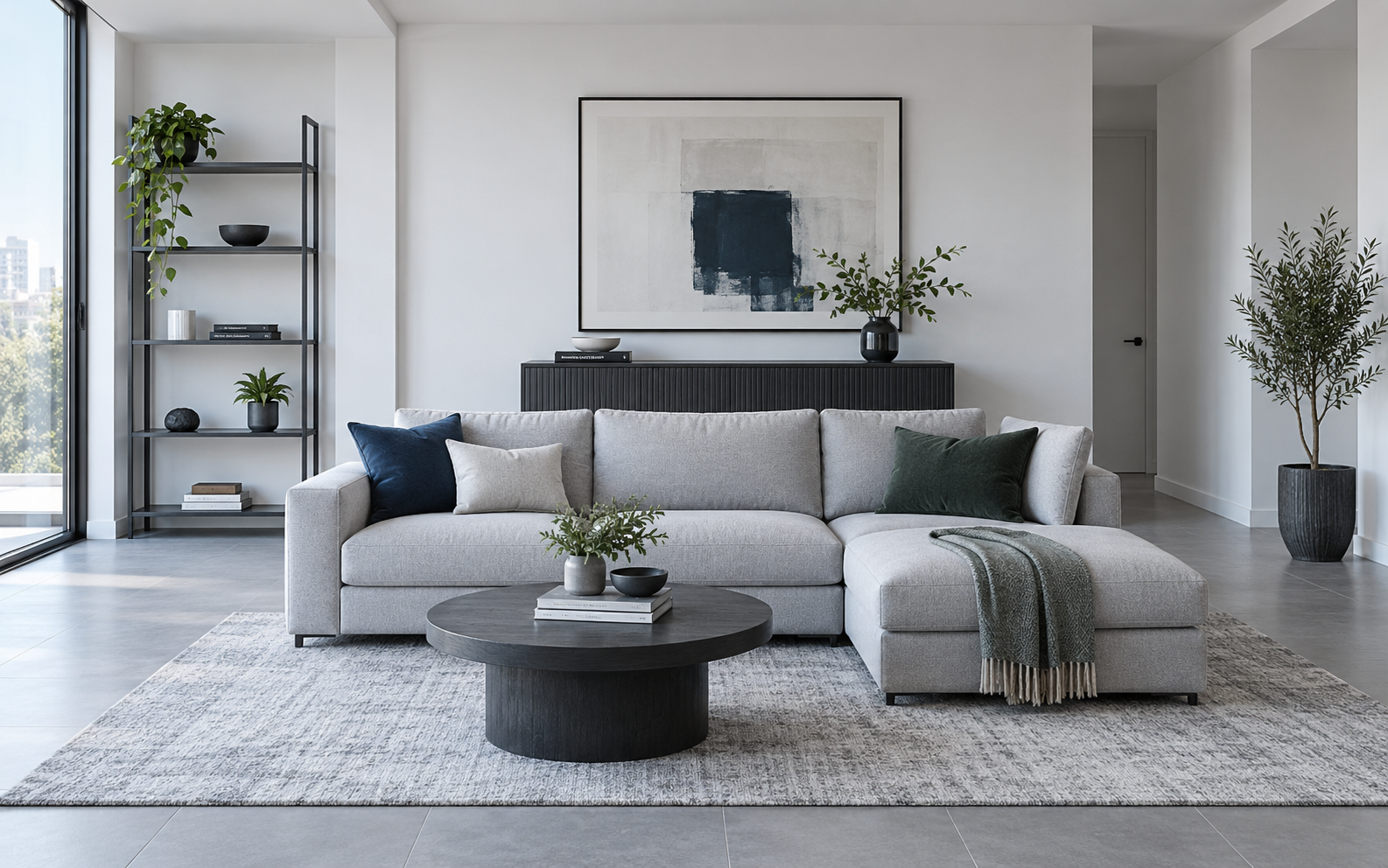
These are not “must-buy” objects. Each one demonstrates the kind of product that fixes a specific room problem.
One deliberate deep-color anchor on pale seating.
Creates a clear boundary for smaller coffee-table pieces.
A strong vertical anchor for a visibly empty floor corner.
A modern dark focal form for an otherwise flat shelf or console.
Choose the visual mechanism you want the accessories to create: stronger form, controlled color repetition or tactile depth.
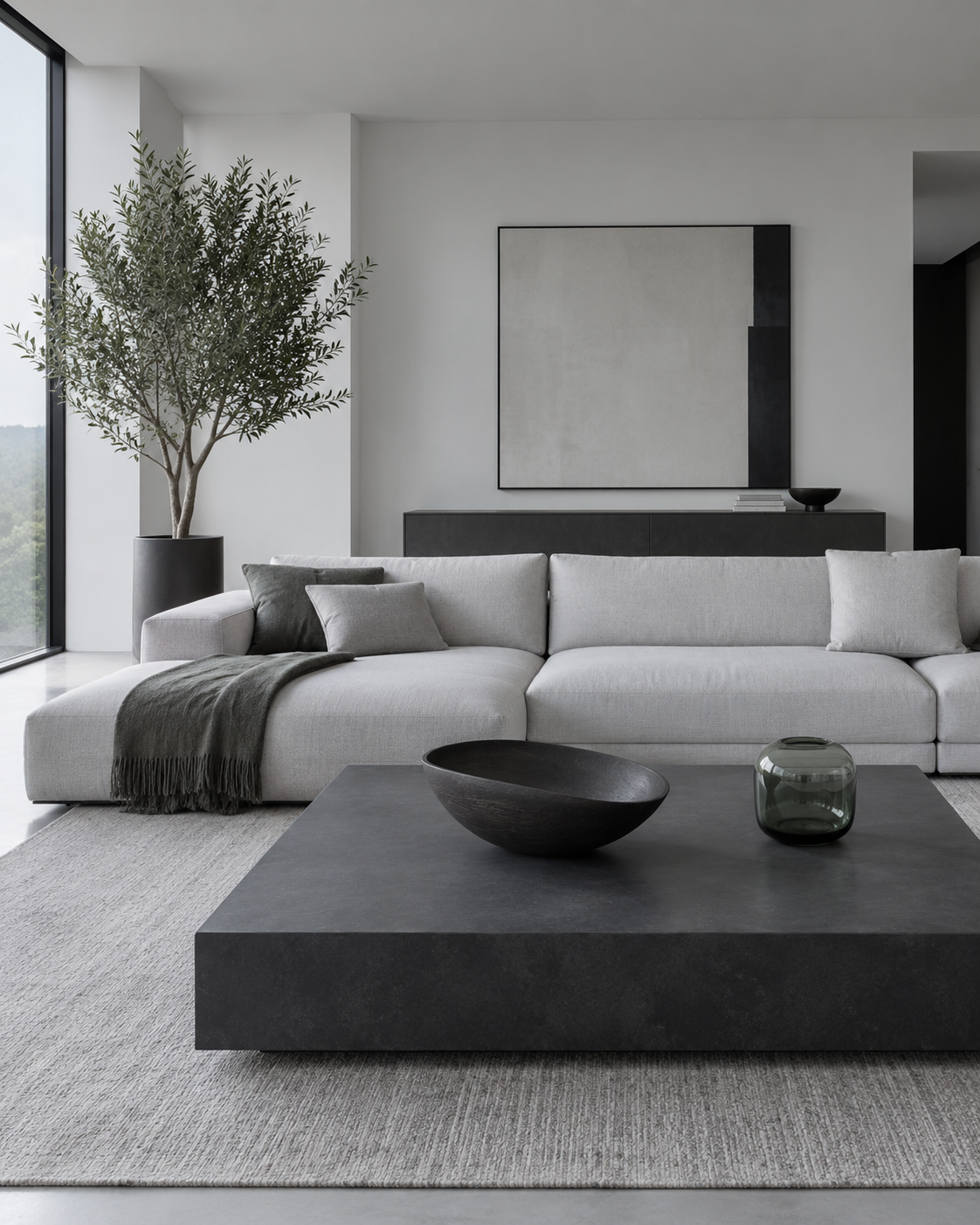
Let scale, silhouette and material do the work. Fewer objects; stronger forms.
Use this on console + shelf →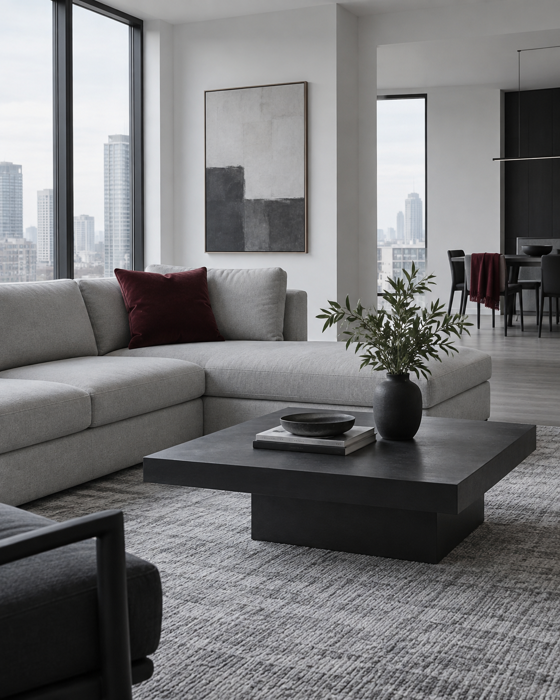
Introduce one deep accent and let it reappear once. Repetition makes color look intentional.
Use this on the sofa →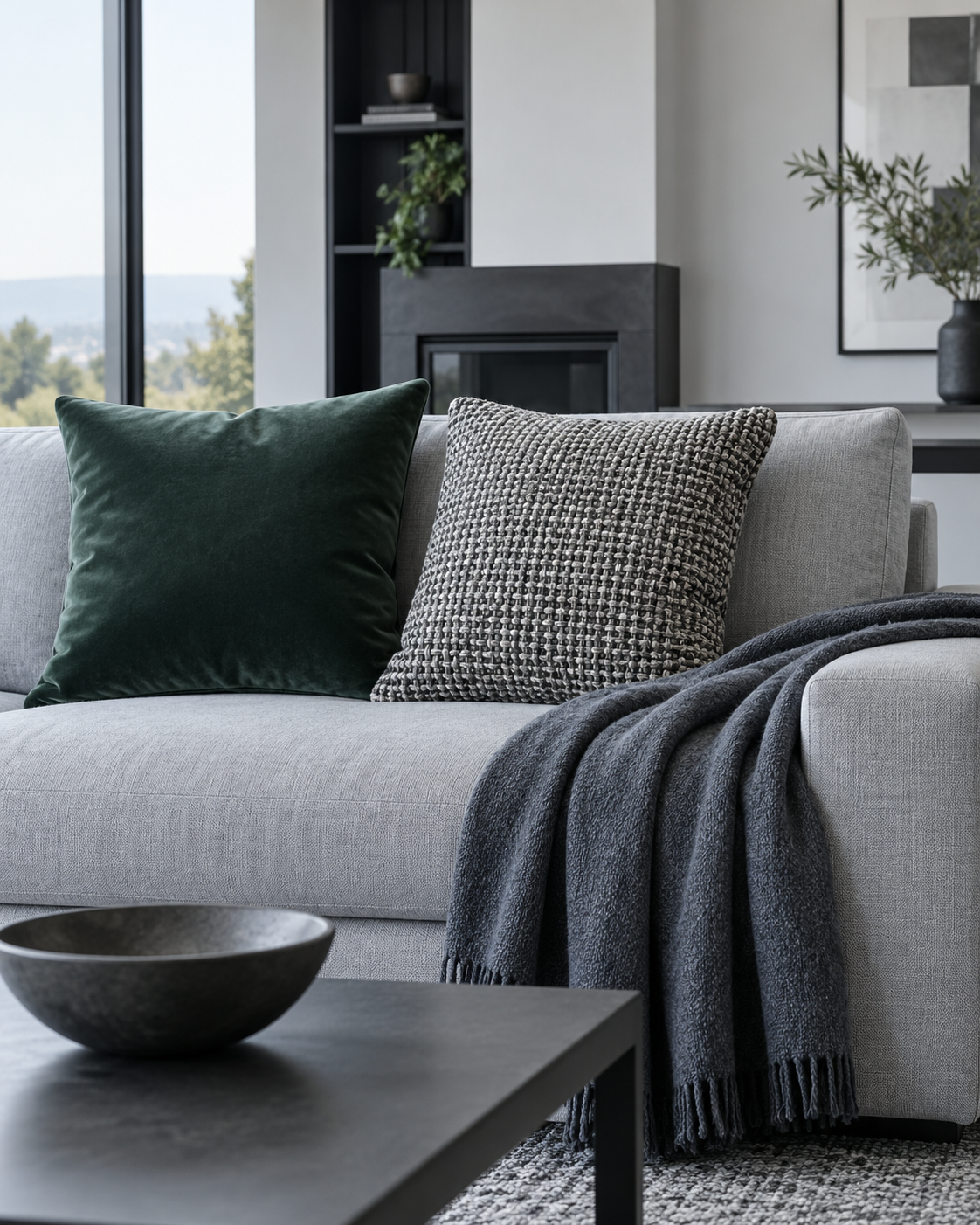
Change the feel before changing the quantity: velvet, woven texture and one soft throw.
Build the sofa formula →Use the sofa to repeat a color or texture already present in the room—not to introduce five new stories.
The goal is not a pillow count. It is a readable relationship between softness, contrast and usable seating.
Choose the deepest color or strongest texture.
Add a quieter texture that makes the anchor feel deliberate.
Repeat one color elsewhere, then stop.
Quiet texture for a sofa that needs softness, not another strong color.
Texture plus a controlled green echo.
One deliberate deep-color anchor on pale seating.
A cool dark accent when green or burgundy is not the right route.
A stronger green echo when foliage already exists.
Cool color and softness without adding another surface object.
Deep textile contrast with visible texture.
Structure and softness while keeping the palette quiet.
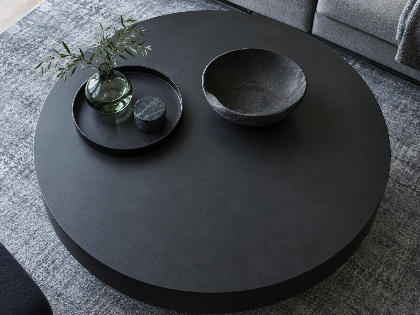
A good coffee-table composition does not occupy the whole table. It groups small pieces so the room feels calmer and daily life still fits.
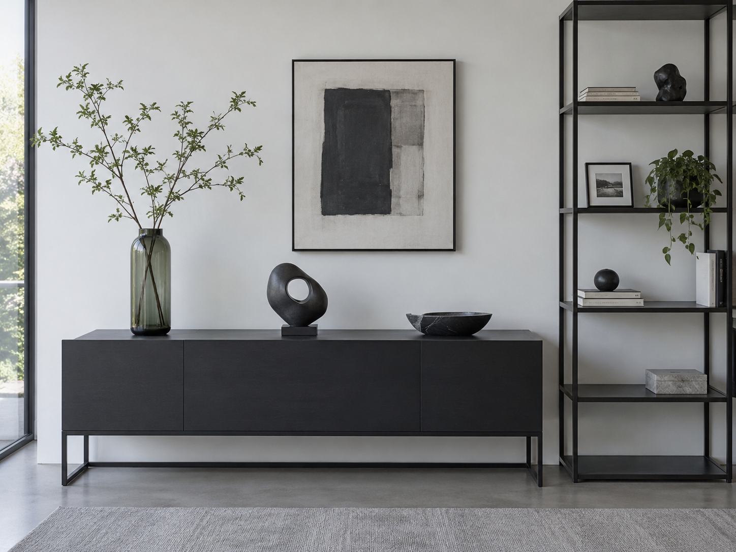
Height hierarchy gives objects a relationship. Empty shelf space is not unfinished—it is what lets the useful objects read.
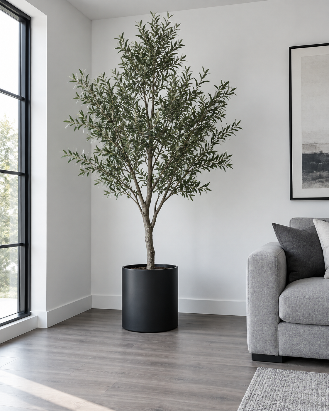
An empty corner usually needs vertical weight—not a new cluster of baskets, pots and floor accessories.
Use this as the shorter route when you already understand the room problem and simply want a strong starting set of options.
A strong vertical anchor for a visibly empty floor corner.
ExploreOne deliberate deep-color anchor on pale seating.
ExploreStructure and softness while keeping the palette quiet.
ExploreShape plus controlled green color in one object.
ExploreCreates a clear boundary for smaller coffee-table pieces.
ExploreOne substantial dark form can replace several small objects.
ExploreAdds sculptural form while keeping books organized.
ExploreCandle form without relying on an open flame.
ExploreEditing is part of decorating. When objects begin competing rather than supporting one another, the room has crossed the line from finished to filled.
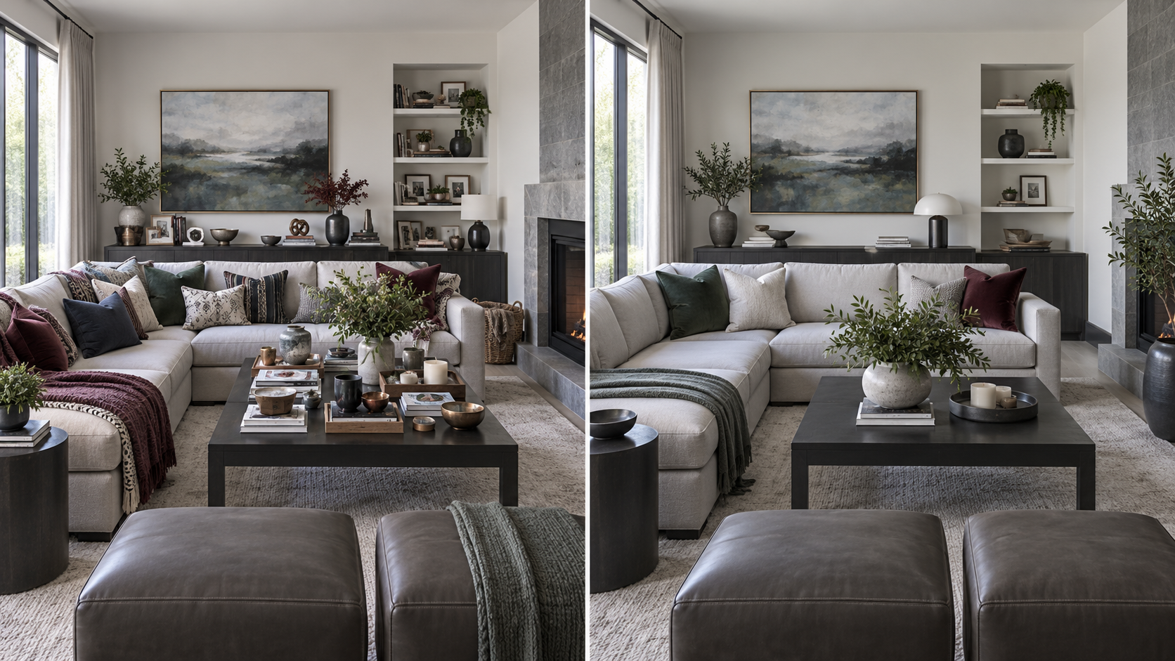
Small objects compete across every surface, colors repeat without hierarchy and the sofa loses usable space.
All 45 unique products are organized by job. Families stay collapsed until you need them, so the library remains a retrieval tool rather than a product wall.
Quiet texture for a sofa that needs softness, not another strong color.
Texture plus a controlled green echo.
One deliberate deep-color anchor on pale seating.
A cool dark accent when green or burgundy is not the right route.
A stronger green echo when foliage already exists.
Cool color and softness without adding another surface object.
A softer color route for gray or charcoal seating.
Deep textile contrast with visible texture.
Structure and softness while keeping the palette quiet.
A strong vertical anchor for a visibly empty floor corner.
A fuller green silhouette when the corner needs more visual mass.
Compact organic height for a smaller console or shelf.
Vertical movement without committing to another floor plant.
A broad-leaf alternative for a substantial floor anchor.
Compact architectural greenery for tighter floor or console zones.
A non-plant vertical anchor for a narrow empty zone.
Grouped vertical form for a wider blank floor area.
A quiet vessel when surrounding objects already provide color.
One sculptural vessel for a table or console focal shape.
Shape plus controlled green color in one object.
Dark translucent contrast without another solid-black object.
A cool colored-glass option for a restrained accent route.
Creates a clear boundary for smaller coffee-table pieces.
A lighter bowl when a dark object would add too much weight.
One substantial dark form can replace several small objects.
A dark boundary for corralling loose tabletop pieces.
A rectangular organizing route with a softer material character.
A heavier material statement when the bowl itself is the focal texture.
Compact scent-and-glow layer for a practical surface.
An alternate scented candle route for a console or table.
Narrow vertical movement plus dark contrast on a console.
A restrained metallic accent when the room needs a small warm counterpoint.
Candle form without relying on an open flame.
A light sculptural form where another dark object would feel heavy.
A stronger silhouette for a shelf or console focal object.
A modern dark focal form for an otherwise flat shelf or console.
Cool sculptural contrast with a lighter visual weight.
A colored-glass material accent when ceramic feels too solid.
A riser for elevating one smaller object into a stronger composition.
Adds sculptural form while keeping books organized.
A simpler functional bookend route for modern shelving.
A personal display layer that does not compete with the room palette.
A cooler metallic personal-display accent.
Concealed small-item storage that still reads as a styled display layer.
A personal object with a practical containment role.
Before opening a listing, know what the object must physically do in your room. Then verify the listing details that control that outcome.
Compare actual dimensions with the table, shelf or console—not with a styled product photo.
Protect room for drinks, remotes, books and everyday movement.
Check ceiling, shelf, branch and candle clearance before choosing a vertical piece.
Glass, ceramic, stone, metal and textiles behave differently in active households.
Verify textile care, insert fit, candle compatibility, batteries and included pieces where relevant.
Know where a new accent will repeat before introducing another color family.
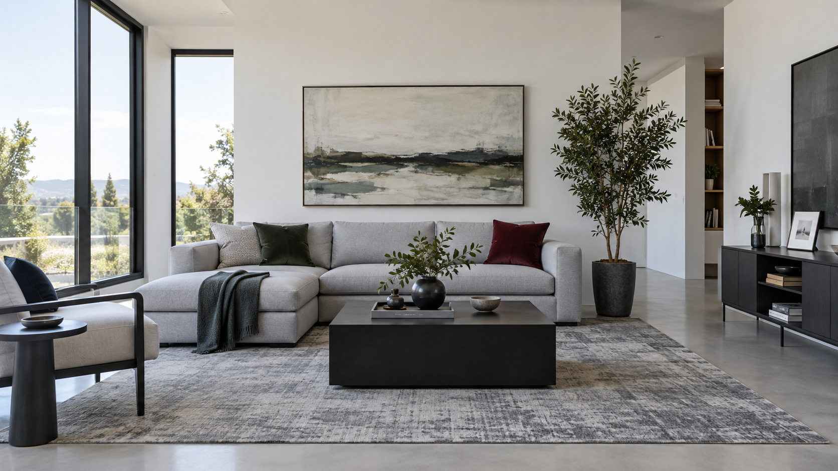
If the room still feels wrong after editing the accessories, the missing solution may belong to another category entirely.