
Furniture-to-wall scale planner
Editorial starting range only—not an installation rule.
Enter the furniture width first. The visual comparison will update with your starting range.
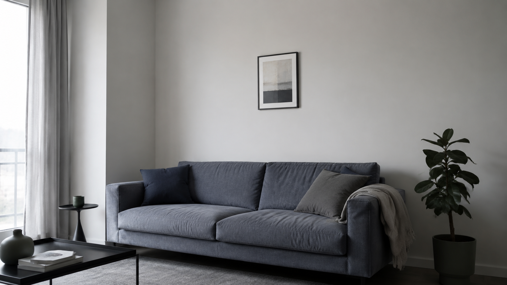
Too blank. Too small. Too busy. Too dark. Choose the symptom first; the page shows the wall move before the products.
Pick the symptom. The page will translate it into a wall move.
Give the eye one confident destination before adding supporting pieces.
Before style, check whether the composition will have enough visual footprint to relate to the furniture below.
Editorial starting range only—not an installation rule.
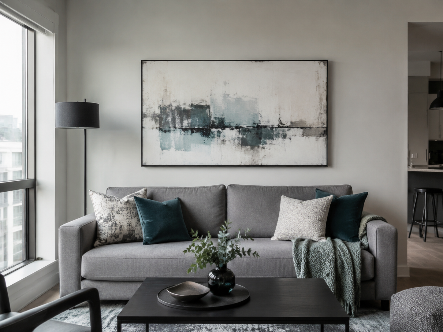
Tap a route. The wall changes first; the shopping options follow the decision.
Best when the wall is blank and the room already has enough furniture detail.
Choose this before mounting anything. It removes the routes that would annoy you later.
If the wall works in daylight and disappears at night, keep the art and change the emphasis.
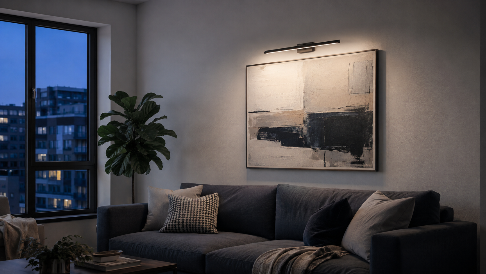
Cleaner-looking install when you do not want cord routing to become part of the wall.
No charging routine, but outlet position and cord management must work with the composition.
Choose the feeling first. Then jump to the matching product family.
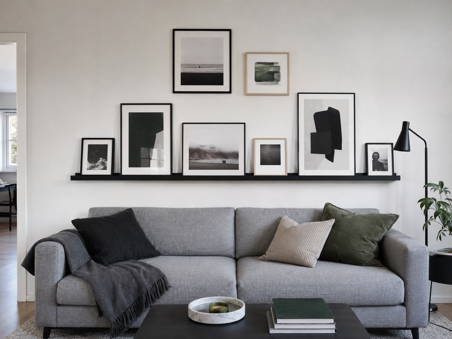
A flexible wall for photos, prints and pieces that change over time.
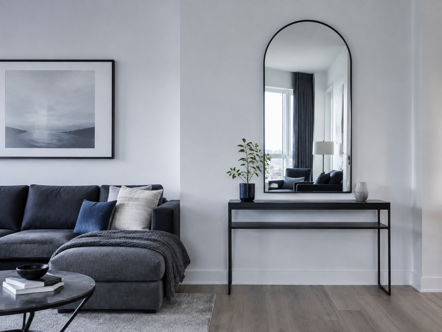
Useful when the wall feels dark, heavy or awkwardly narrow.
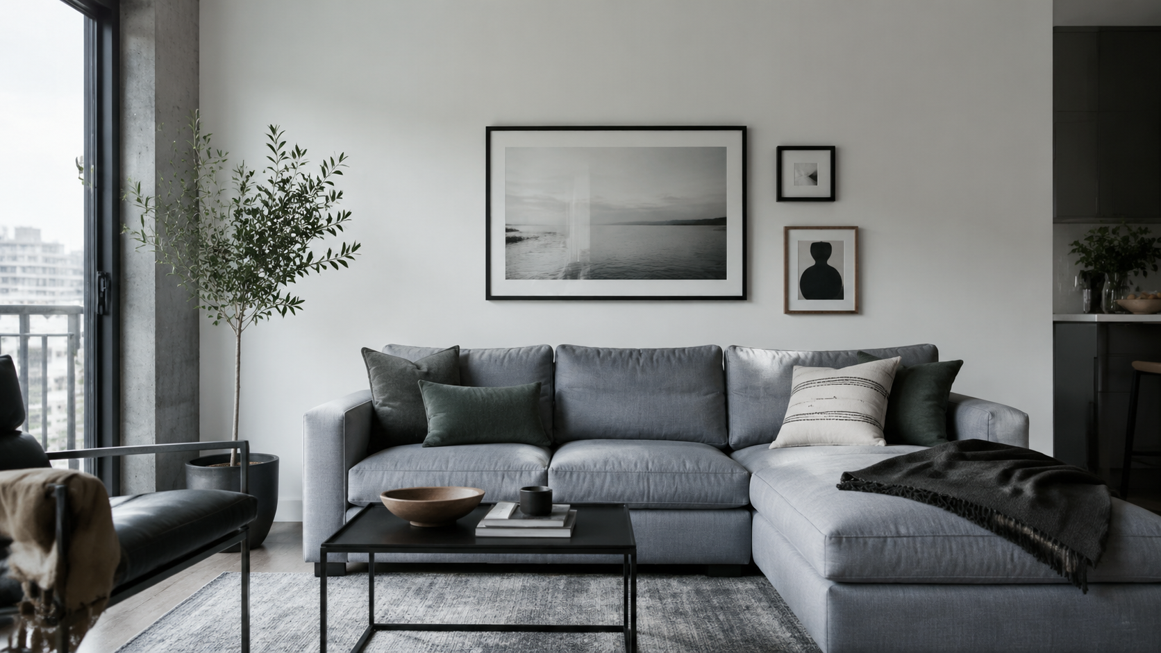
The wall feels complete because the eye knows where to land and some negative space remains.
Each card says what the product is for and what to verify before clicking.
Sometimes the room needs scaling, moving or subtracting—not another purchase.
More tiny fillers usually multiply the original problem.
Let the wall decor belong to the furniture below.
Hierarchy usually beats one more object.
Match the composition direction to the architecture.
Use the library only after the wall decision is clear.
Best when the wall needs one strong horizontal statement.
Broader coverage without the complexity of a full gallery.
Useful when one frame feels too small but you still want one visual story.
A cleaner starting frame language for personal photos or art.
Lets several frames read as one composition and still move easily.
Useful when several shorter ledges suit the architecture better.
Strong when the wall needs height and reflection more than another print.
Softens rooms dominated by straight lines and boxy furniture.
Reflection and personality in the same wall move.
Best when another flat print would feel repetitive.
Physical interest with a quieter, more organic feel.
Vertical presence for tighter architectural zones.